
You invested heavily in a brand refresh. The agency promised a "modern" look with smooth animations, abstract 3D graphics, and a headline about "reimagining the future." Yet, the demo requests aren't coming.
Meanwhile, a competitor with a website that looks like it was built in 2015—dense text, stock photos, zero animations—is capturing the demand you paid to generate.
Why is this happening? You fell into the "Clever Trap." You prioritized sounding smart over being understood. In B2B, clarity is the only thing that sells.
A B2B website fails to convert when it prioritizes abstract, "clever" copy over clear value propositions. Buyers are risk-averse and time-poor; if they cannot answer "What do you do?" and "What’s in it for me?" within five seconds, they will leave. High-converting sites focus on solving specific, expensive problems rather than entertaining the user.
B2B buyers answer to a buying committee. They do not visit your website to be entertained; they visit to solve a specific business problem.
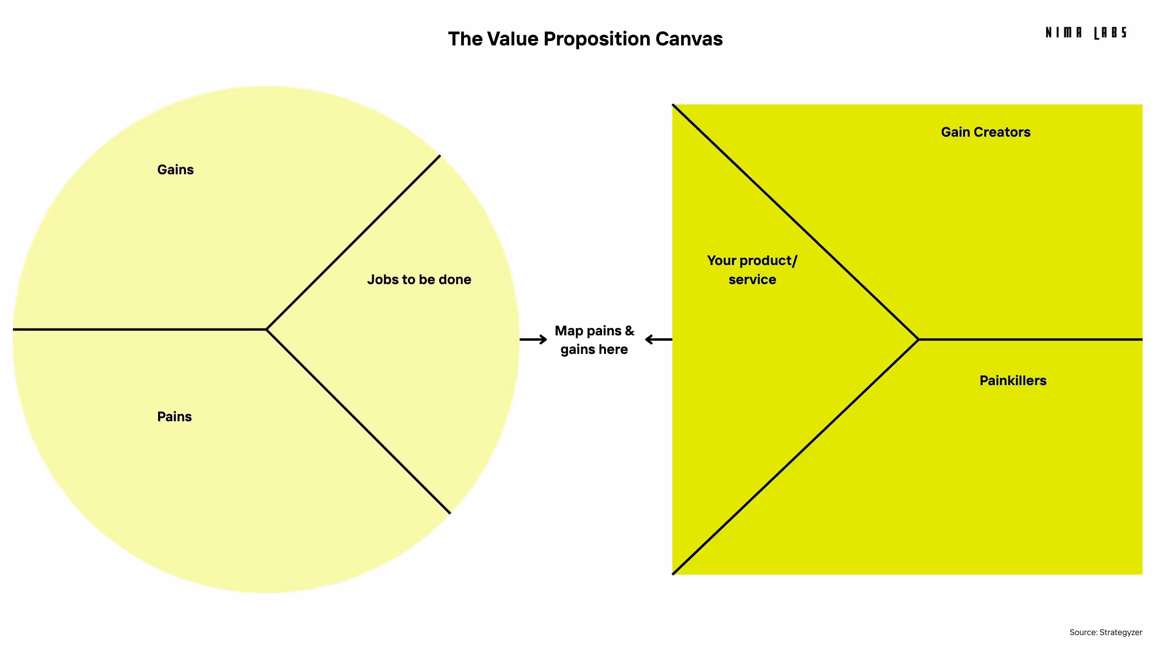
We often see this described as a core "Underlying Problem" for CEOs: The target group simply does not understand what the company does.
Revenue-generating headlines map a specific customer pain to a tangible gain. Unlike "clever" headlines that stroke a founder's ego, high-performing copy uses specific numbers, timeframes, and outcomes to reduce friction and promise a result.
Below is a comparison of "Ego" headlines versus "Revenue" headlines that focus on resource efficiency.
The "boring" approach wins because it acts as a mechanical bridge between a Pain and a Gain.
To write a value proposition that converts, you must strip away adjectives and focus on mechanics. Use the "Pain-Gain-Claim" method: isolate the customer's specific struggle, define your product's feature that solves it, and translate that into a headline with a measurable result.
This process is vital if you want to improve your B2B messaging systematically.
Define a clear, measurable problem your target customer experiences daily. This is the "Job-to-be-Done."
Example: "I waste three days a month manually consolidating sales data across four platforms."
State the specific, unique feature of your service that alleviates that exact pain.
Example: "Our unified dashboard automatically syncs and cleans all sales data in real-time."
Don't start writing by looking for cool words. Start by listing your customer's pains. Combine the gain with the quantifiable result. To summarize:
The most effective way to test website clarity is the "Stranger Test." Read your headline to someone outside your industry. If they ask "How do you make money?", the messaging failed. If they recognize a problem they or a friend have, the messaging works.
Expert Tip: Don’t be smart. Write as you speak. To test if your pitch works, explain it to your spouse. If they don't understand what you do, your potential customers won't either.
Clarity is not a creative writing exercise; it is a process. At Nima Labs, we treat messaging as a core part of our EnablementOS program. We build a data-backed architecture rather than guessing:
It takes courage to be clear. Vague concepts feel safe because they can mean anything to anyone. Specific promises are scary because they can be measured.
But if you want your website to stop being a digital brochure and start being a revenue engine, you have to kill the "clever." Be specific. Be obvious. Be "boring." Your bank account will thank you.
These are optimized for Voice Search and "People Also Ask" boxes.
The "Clever Trap" occurs when companies prioritize sounding sophisticated or abstract over being clearly understood. This leads to vague headlines that confuse users, resulting in high bounce rates because potential buyers cannot quickly determine what the company does or how it helps them.
In B2B, buyers are risk-averse and answerable to stakeholders. They are looking for specific solutions to expensive problems. Clarity reduces the cognitive load required to understand an offer, whereas abstract creativity forces the buyer to guess, often causing them to leave the site.
You can improve conversion rates immediately by rewriting your H1 headline to address a specific customer pain point and offering a quantifiable solution. Ensure the "What do you do?" question is answered in the first 5 seconds of the user's visit.